14 Diverse
14.1 Selecting cases
In Variable View, use icon ‘Select cases’ or the menu Data/Select cases/Tick ‘If condition is satisfied’, press ‘If’ button. Next click/drag/simply write the name of the variable you wish to select on to the upper right empty box and specify the condition for selection. Examples of conditions based on the Vitamin D data week 1:
- Specify
country=4to select the Eirish women. - Specify
country=1 | country=4to select the Danish and the Eirish women (|corresponds to ‘or’).
To remove the selection again use the ‘Select cases’ menu, tick ‘All cases’.
14.2 Logaritmetransformation
See the quiz of SPSS intro on Calculation of new variables
Use menu Transform/Compute Variable and define the name of the new variable in Target Variable (e.g. the img-variable in Immunoglobulin data week 1), and enter in Numeric Expression:
- Lg10(
img) for the log base 10 - Ln(
img) for the natural log - Lg10(
img)/Lg10(2) for the log base 2 (there is no log-2 function in SPSS, but all logarithms are proportional and therefore we can calculate the log-base-2 as a fraction using any log (here the log-10)) - Lg10(
img)/Lg10(1.1) for the log base 1.1 etc…
Next make a histogram and a QQ-plot to study the distribution of log-transformed immunoglobulin.
14.3 Tilføjelse af datatilpasset kurve til histogram
Du har i slides set histogrammer, hvor jeg har lagt en normalfordelingstæthed og en datatilpasset tæthed oveni.
Det er ganske besværligt at lægge den datatilpassede tæthed på. Nedenfor viser jeg i en video, hvordan det kan lade sig gøre. Jeg anbefaler ikke at du afprøver dette, før du er blevet godt fortrolig med SPSS og har prøvet at arbejde lidt med syntaksfilen. Det er ganske avanceret og teknisk.
To add a curve adapted to the data, as shown in the slides, you need to use SPSS syntax. I show how in this video (10 min, måske viser din browser den lige herunder (ikke alle browsere integrerer videoer)). The pdf I find in the video is found here.
The syntax explained in the video is:
GGRAPH
  /GRAPHDATASET NAME="graphdataset" VARIABLES=vitd MISSING=LISTWISE REPORTMISSING=NO
  /GRAPHSPEC SOURCE=INLINE.
BEGIN GPL
  SOURCE: s=userSource(id("graphdataset"))
  DATA: vitd=col(source(s), name("vitd"))
  GUIDE: axis(dim(1), label("vitd"))
  GUIDE: axis(dim(2), label("Frequency"))
  GUIDE: text.title(label("Histogram af Vitamin D for irske kvinder"))
  ELEMENT: interval(position(summary.count(bin.rect(vitd))), shape.interior(shape.square))
  ELEMENT: line(position(density.normal(vitd)), color(color.blue))
  ELEMENT: line(position(density.kernel.epanechnikov(vitd))), color(color.red))
END GPL.
The syntax for making a histogram is first generated. The title of the plot is modified in the last GUIDE-line.
Next the last two ELEMENT-lines are added before the END GPL.-statement. Don’t bother too much about the details of the code, just copy the lines to your own syntax-window (and be aware, if you use another data example to replace vitd with the name of your variable).
The result is:
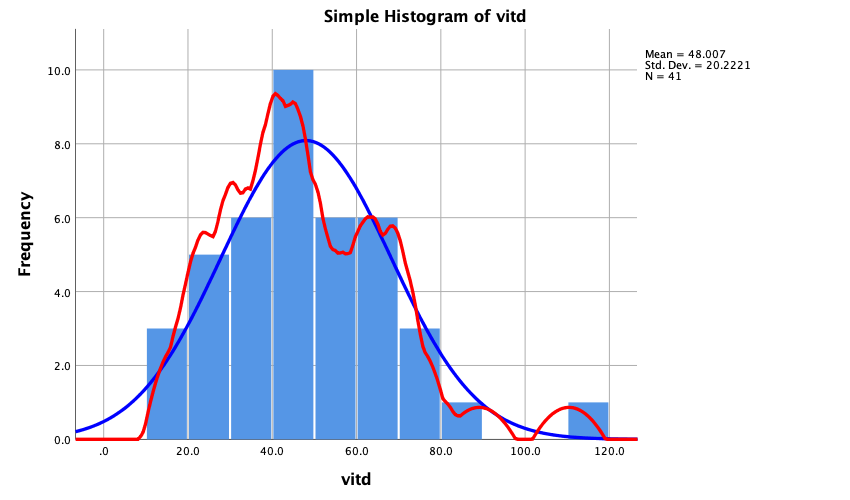
Det er tilsyneladende ikke nemt (muligt?) at gøre kurven mere udglattet. Hvis du finder en løsning hører jeg meget gerne fra dig …