2 Illustrationer
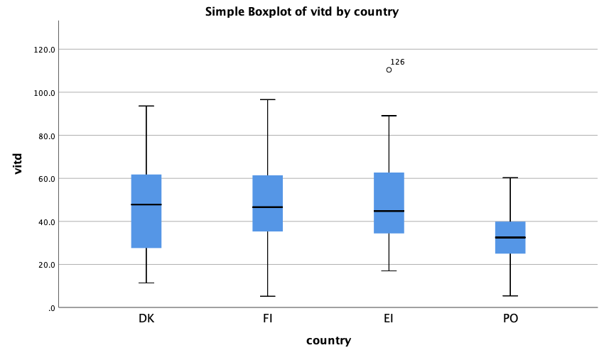
2.1 Boxplot
See how to make boxplots in SPSS intro on boxplots.
For the vitamin D data (slides week 1) we use the country-variable on the X-axis, the vitd-variable on the Y-axis:
2.2 Histogram
To make a histogram for the Eirish women in the vitamin D data (slides week 1) first select the Eirish women (country code 4) (see how to select cases in Chapter ??).
Next the histogram is made following the details in the SPSS intro on histograms):
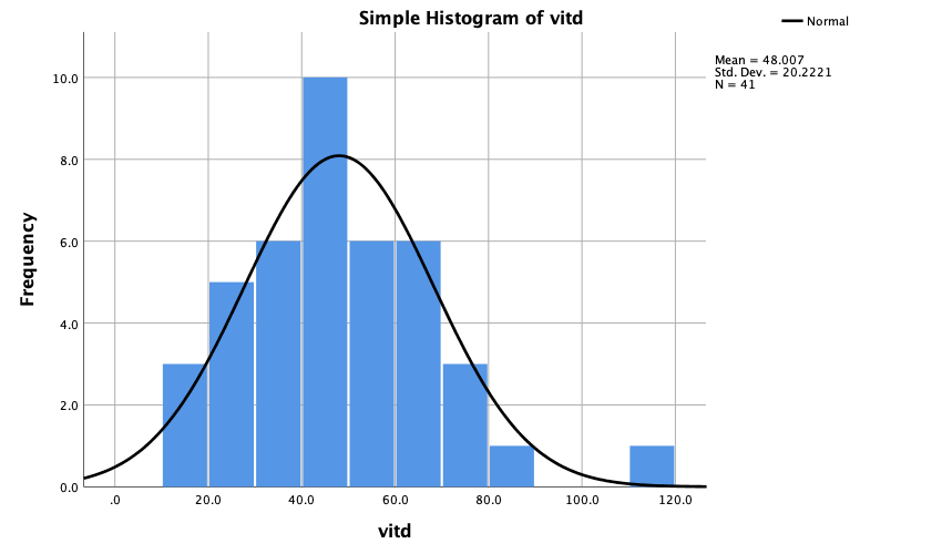
Advanced: To add a curve adapted to the data, you need to use SPSS syntax. Find a small introduction on how to use Syntax in SPSS in Chapter X ref. Find a small introductory video on 'Kernel density plots in SPSS' here and use the following syntax to add normal density and kernel density to the histogram:
GGRAPH
  /GRAPHDATASET NAME="graphdataset" VARIABLES=vitd MISSING=LISTWISE REPORTMISSING=NO
  /GRAPHSPEC SOURCE=INLINE.
BEGIN GPL
  SOURCE: s=userSource(id("graphdataset"))
  DATA: vitd=col(source(s), name("vitd"))
  GUIDE: axis(dim(1), label("vitd"))
  GUIDE: axis(dim(2), label("Frequency"))
  GUIDE: text.title(label("Simple Histogram of vitd"))
  ELEMENT: interval(position(summary.count(bin.rect(vitd))), shape.interior(shape.square))
ELEMENT: line(position(density.normal(vitd)), color(color.blue)) ELEMENT: line(position(density.kernel.epanechnikov(vitd))), color(color.red))
END GPL.
The syntax is first copied from the syntax generated in the output window when making the histogram. Next the two highlighted lines are added (I found the code here). Two extra ELEMENTs are added (specified using line()) and the color is specified using an extra color argument.
When you want to work on the complete data set again, you can remove the selection using the menu Data/Select cases/'All cases'/'OK'.